Radiant; Stories of Colour
By Adam Snow
To categorize, label or reproduce colours, the infinite span of shades and light visible to the human eye seems an almost impossible task. The term ‘blue’, for example, captures a range of hues from the bright turquoise of a tropical sea to the deep deep navy of the wide ocean; from the delicate shades of the cornflower to your very favourite pair of blue jeans.
Given the millions of colours available to us, how can we pick out each individual one, and describe to others the beauty which we are seeing? Today, the Pantone Matching System allows us to digitally organize and replicate virtually any colour. Long before Pantone, however, the British Colour Council set out to accomplish this task.
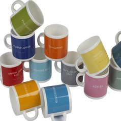
1931, the British Council created The Dictionary of Colour Standards, giving names and numbers to colours that could then be reproduced throughout Britain. The cloth-bound dictionaries contained numbered dyed ribbons, each named after the natural occurrence which the ribbon’s colour most resembled or reminded of. Listing colours such as guardsman red, peacock green, and lapis lazuli, the dictionary served as a guidebook for the visual world.
The London based design company British Colour Standard have set out to capture and reproduce this variety, richness and depth of colour.
British Colour Standard’s art and design team, Jackie Piper and Victoria Whitbread rediscovered this original dictionary at an Oxfam and have since reimagined its contents for modern decoration purposes. Each colour’s name evokes a history and imagery much deeper than first meets the eye.

Take, for instance, colour no. 226: Maize. Defined in 1938, Maize is listed by British Colour Standard as the colour matching the ‘cereal grain first domesticated by indigenous people in southern Mexico about 10,000 years ago.’
Though the colour itself could be described as a sort of pale gold, the name maize describes a much richer historical image, one of the grain being planted and grown from the earth, and of Indigenous Americans relying on the crop for sustenance through the year.
Similarly, colour no. 36: Kenya Red, invokes the image of deep, rich Kenyan soil. No. 140: Nanking Blue, describes the colour found in Chinese silks and reminds us of the image of high tea among ancient Chinese Royalty, while No. 58: Saffron matches the bold, expressive orange of the flavourful flower. Each colour reminds us of an image, a story, or a feeling.

NO. 140 – NANKING BLUE 
NO. 36 – KENYA RED 
NO. 58 – SAFFRON
In 2017, British Colour Standard officially revived the once forgotten Dictionary of Colour Standards. Today, they offer these rich colours as luxury water-based paint, candles, ceramics, and hand-blown glassware. Each piece, carefully conceived with combinations of these colours, is reminiscent of the feelings and memories these names evoke.


Their full catalogue is available for viewing here.
Photographs are courtesy of British Colour Standard.