Saturate; Wes Anderson’s World of Colour
By Jo Phillips

Colours are able to convey emotions and, when used with a specific intention, they can improve and bring to life imaginary locations, people, and even film plots. Wes Anderson is one of the few movie directors who constantly experiments with colour and lighting in his films, creating an instantly-recognisable aesthetic.
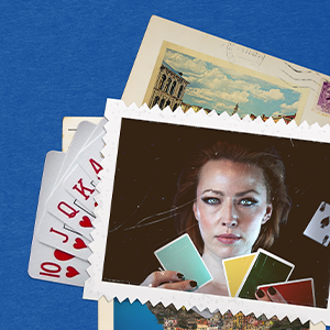
Each of his films uses a specific colour palette to portray the characters and their stories. The pastel hues used in many of his iconic films, such as The Grand Budapest Hotel and The Moonrise Kingdom, create a dream-like and almost artificial world in which his characters live somewhat between reality and fantasy. Colour is truly the unspoken element that brings Wes Anderson’s films to life. His uncommon choice of colours in his films is able to capture the attention of the viewer and create imaginary worlds unlike no other.
Anderson does not restrict his choice of colours only to set, but rather extends them towards production design and costumes. Set and costume designers who have worked with Wes Anderson – like Kris Moran, Adam Stockhausen, and Milena Canonero – have been awarded for their work with many outstanding awards such as Oscars, BAFTA, and Critic’s Choice.
Wes Anderson and his team often include many colours which reoccur in many of his films like light blue, French mustard, and red. Through their use, Anderson has established a uniqueness that can only be found in his creations and, as a result, the viewers can easily identify his work.
Here are some Wes Anderson films to bring colour back to your life:
The Grand Budapest Hotel (2014)
Isle of Dogs (2018)
Moonrise Kingdom (2012)
Life Aquatic (2004)
The Royal Tenebaums (2001)