Sharp: Milan Design Week
By Jo Phillips
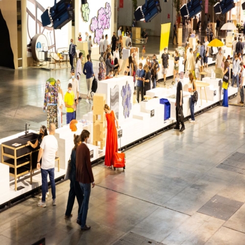
Milan during Design Week is something pretty special. The whole design world flocks there to trade, deal, see, style and party. There is so much going on that it is literally impossible to see everything that is on show and so I thought I would cover a few highlights that I found interesting whilst I was there.
Wrong For Hay Pop-up Shop was packed both times I visited it in the Brera District. The space was put together very cleverly to showcase the Hay and Wrong for Hay collections with an added mini mart style shop where visitors could buy smaller Wrong for Hay accessories in a cash n carry style setting. Danish brand Hay are a firm favourite with their sustainable approach and beautiful but more affordable designs and furniture designer Sebastian Wrong is homegrown talent and their collaboration Wrong For Hay continues to be a success. On display there were huge fabricated pillars wrapped in Nathalie Du Pasquier Wrong For Hay Graphic prints (see image above), modular shelving and household goods by Shane Schneck and one of my favourites was the geometric mirrors designed by Doshi Levien for Hay.
Wallpaper* Handmade is a hive of creativity, designers are paired with manufacturers to create unique designs especially for this showcase during Design Week. With so many collaborations to chose from it’s hard to pick favourites but as I noticed previous .Cent contributors there I feel compelled to put the spotlight on the Patternity girls who together with Belgian Haute Chocolaterie Maison Pierre Marcolini’s and bespoke furniture maker Toby Winteringham created The Structure of Chocolate which was visually delicious. The other previous contributer that caught my eye was SO-IL who together with 3M erected a flying cube made of lots of colour shifting, shimmering layers of dichroic glass film from the 3M collection creating a structure that very cleverly played with light and reflection.
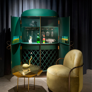
EDIT by designjunction took over Palazzo Morando a beautiful historic building in the heart of the fashion district. They had lots of brands including Modus, Stellaworks and EOQ. One of my favourite collection here was the De Allegri / Feldkamp collection pictured below.
Ventura Lambrate was well worth the metro ride and was curated brilliantly with so much talent and vibrancy that again it’s hard to pick what I loved the most. My love of colour and graphic patterns push me towards Ferreol Babin’s hand-painted beech tables and mirrors which was part of the Another Perspective 2 show curated by COTTO. I was also intrigued and talked into giving a piece of my own hair for the hypertrichosis bow tie by Anouk Van Klaveren, so much so that I am going to save the details for another article.
SOUND SERIES by ASIM KHAN with Stone Island is a study of craftsmanship, quality and artisan textiles in British heritage through the medium of sound. This project takes sound waves create on screen and translates that aesthetic onto patterned fabrics and I loved the way a sound became a visual and was then translated onto a fabric. It’s quite a unique way to design!
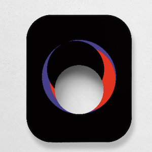
Rossana Orlandi needs no introduction, she is a style icon herself and her shop is one of the most interesting exhibitions during the week. The space was originally an old tie factory and has a courtyard and various rooms showcasing both new and vintage wares. There was everything from curioso to Punkt with a collection including phones designed by Jasper Morrison. One of my favourites here was the medallion mirrors by Room seen below (please excuse the poor picture).
COS x Nendo created an dip dye shirt installation in the Brera district paying homage to the white shirt very cleverly. The shirts were suspended at different levels and had a high impact with a minimalistic edge. I love my white COS shirts so this one resonated!
Kvadrat X Raf Simons collaboration unveiled a range of textiles for homes furnishings and accessories in a mixture of bright and muted tone and with a strong focus on specially constructed textured fabrics. The space used geometric lines to offset the materials used and an array iconic pieces of furniture from some of the best design companies including Arper, Cappellini, Fritz Hansen and &Tradition were used. Furniture pieces from historical designers such as Charlotte Perriand, Finn Juhl and Arne Jacobsen sat alongside contemporaries Jaime Hayon and Rodolfo Dordoni to bring to life the Kvadrat x Raf Simons collection.
Studio Job X NLXL – I LOVE Studio Job as they always create beautiful sometimes one-off timeless pieces and have worked with Viktor and Rolf (some of which was used for this collection). At design week they were showcasing a new wallpaper they have made for Dutch brand NLXL. They looked to their own archives to create this and the they wallpapered the floor, the wall and used the print on chairs in their space. I spent half an hour looking through their print books, pouring over and studying the detail in the print. Fabulous!


