Brazen: Grey Boxes
By Jo Phillips
Few, if any architectural styles are as brazen as brutalism. For me, to be brazen is to be bold, undisguised and shameless but also stubborn, and it is this stubbornness that sees brutalism withstand a huge amount of criticism whilst maintaining a loyal band of followers. The grey box may have become homogenous and synonymous with drab 60’s public housing, but its effectiveness in the right hands is too often overlooked.

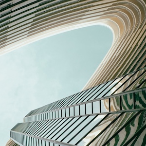
Image of Stock Exchange – Day. Source: Designboom.
Rem Koolhaus and the Dutch based Office for Metropolitan Architecture (OMA) have long championed simple yet brooding geometric forms. OMA’s recently completed Shenzhen Stock Exchange is architecture that quite literally means business. It’s brazen, bold, unembarrassed and even a little cheeky, nicknamed ‘The Miniskirt’ for the horizontal element that sits 36 metres above ground overshadowing a public space below. It’s a remarkable feat that this building retains some softness and romance, and gives hope for fans of the brutal everywhere.

Image of Stock Exchange – Night. Source: 1.bp.blogspot.com
It’s a grey box, yes. It’s two grey boxes. Describe it and many will probably think of the Southbank Centre and wonder why the hell we haven’t given up on this type of thing. But this is the brutal liberated from its 1950s origins and blasted into some classy dystopian financial future. What looks like concrete from afar is in fact a structural grid overlayed with a glass skin, one that remains appropriately austere on an overcast day but becomes almost transparent at night. OMA aren’t alone in showing that the brazen grey box can be inspiring: Japanese architect Tadao Ando has been doing it for years. A few years after Ernő Goldfinger’s Trellick Tower went up in North Kensington (later becoming britpop’s go-to music video backdrop), Ando’s Azuma House graced Osaka, one of, if not the most austere residential project I’ve ever come across.

Image of Azuma House. Source: farm4.staticflickr.com
This is brutalism in the extreme, going as far as to fetishise the marks left by the precast concrete’s moulds, and yet it works to create spaces that are surprisingly sensitive. Ando’s box slips into a tiny urban site, where its passive form appears anything but. No one can deny the raw power of a space like Ando’s Church of the Light; this is the same attitude and material that has led to some of England’s most despised architecture. There’s nothing wrong with brutal, grey box-like architecture, it is simply a victim of too often being the product of laziness when it should be proud of what it is.

Image of Church of Light. Source: 2.bp.blogspot.com.


