Colour Is A Code
By Fleur Chattillon
The rainbow with its red, yellow, pink and blue is just a tiny fraction of the amount of colours we can actually see. It’s thought the human eye can see around one million different colours. We all feel the power of colours, whether it be in our homes or the clothes we wear we know the impact. In fact, there have been endless studies about the meaning and reactions we get from certain colours. And they are used as a powerful communication tool, with companies carefully choosing colours that they want to be associated with. Basically, we colour our own lives to make them emotionally richer. But which colour do you choose? Read all about it in Colour Is A Code.
It’s quite fascinating to know that as far back as 1666 that the English scientist Sir Isaac Newton discovered that when pure white light passes through a prism, it separates into all visible colours. Newton also found that each colour is made up of a single wavelength and cannot be separated any further into other colours.
But why is colour such a powerful force in our lives? What effects can it have on our bodies and minds? While perceptions of colour are somewhat subjective, some colour effects have universal meanings.
Several studies that surveyed the emotional associations of people from 30 different countries found that people commonly associate certain colours with specific emotions. Of course, this is different per country or culture but the general outcome is quite similar. Most associated red with love and orange with joy.
And Green for many is, of course, Nature, growth, freshness and Yellow for Hope, joy, danger and so on.

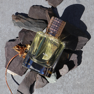
Across the worlds of food fashion and beauty, colour is everywhere, there to entice but like the great colourist artist Matisse, only a few can make tints, shades and tones pop, bringing them vital alive and passionate. One leader in the fashion and beauty industry is of course CHANEL.
The clothes and make-up traditionally have ben filled with luscious tones and their newest limited edition lunch is no different.

This exciting new limited edition has just launched called ‘Codes Couleurs’ accessories consisting of nail files, mirrors and brush sets, made up of jazzy, bright and delicious colours. As they describe it themselves:
‘ They are colours that do not hide. They are colours that reveal, that enhance. That makes contrasts more distinct. They establish relationships between brightness and saturation. They elude all that is anecdotal. That is how they became codes.’


They selected and chose the colours for their collection carefully and made sure the tints either complimented or contradicted each other. It varies from yellow tints to purple, pink, red, blue, grey and veneer.


They chose a few different types of almost candy-like light pastel tones elegant but youthful for their products such as lilac, baby pink, sage green and tangy yellow.


But want to go brighter? then the playful tones of fiery red-orange, juicy fuchsia pink, and a hue of salmony pink coral are there for the taking.
From sweet candy, all the way to dark and deeper pigments such as sexy Rouge noir and elegant deep blue.


But CHANEL hasn’t only added some new colours and products to their accessories line, The CHANEL Makeup Creation Studio has proven that it has creativity at its fingertips, by revisiting the LE VERNIS line and adding some rich colours to the collection of 24 shades.

They are introducing 17 new nail polish hues to match every mood and emotion this season while maintaining seven emblematic shades. Colour is envisioned as a language, to reflect a style, like the detail that makes all the difference in exploring its unique colour vocabulary.
Taking a slightly new route they have chosen five main colour families for this collection and in these five groups, they’ve given each evocative colour its own character.

There is a group called ‘Colours that Energize’ which includes radiant shades that can boost your energy such as a fire red, vibrant
fuchsia pink, a bright coral and rich, intense plum. Which also overlaps with the colours in the accessories collection.


Another group is called ‘Colours that Soothe’ with more soft neutrals tones, that inspire calm, comfort and serenity with light pink and latte-coloured beige. The next group is ‘Colours that bring Joy’ Think fresh, light and optimistic hues that encourage playfulness soft cloud blue, fresh lilac and zesty yellow.


The last two groups are ‘Colours that Disrupt’ with mostly tones that break the rules in order to establish their own. Subtly dimmed and muted shades that range from pink-infused terracotta to androgynous grey with khaki accents.
And the last one is called ‘ Colours that Provide Strength’ which is designed to be worn as a manifesto, so core to the very values of Coco herself, consisting of three assertive and alluring shades of red, that ubiquitous CHANEL tone.


And the way the accessories’ colour options come together with the nail-polish collection gives the possibility to mix and match all the colour possibilities, which in a way all complement or contradict each other.
For more information about the Codes Couleurs collection go here
For more information about the Le Vernis collection go here
If you enjoyed reading Colour Is A Code why not read Colour Time?
.Cent Magazine London Be Inspired; Get Involved