Digital: Say It With Words
By Jo Phillips
In the age of digital, when you receive poster books and books printed on nice, textured paper with some interesting typography, foiling and bright colours, you do tend to pause – to flip through, touch and feel the books. And that’s just what we did a few weeks ago at office. We so love print and books at .Cent, and with our theme for the month being ‘Digital,’ we decided to celebrate everything digital and print.
We looked at interesting projects in print for inspiration and discovered ‘I Like It. What Is It?’ by Anthony Burrill, published by Laurence King. Another interesting book was ‘5-9 – A Collection of Creativity from Outside of the 9-5,’ brought out by the West of England Design Forum. We chose to explore the works of two designers who did posters, Bob Mytton and Kerry Wheeler, and asked them all one quick question: In the age of digital, how much joy does it give them going back to the roots: the way of colour, sketches on paper.
Anthony Burrill
Anthony Burrill is a graphic artist, print-maker and designer. Burrill is known for his persuasive, up-beat style of communication and for his typographic, text-based compositions.’I Like It. What Is It?’ is a collection of unique posters featuring catchy typographic slogans by Burrill. Simply pull out the detachable prints and display the bright statements on your wall.

I LIKE IT. WHAT IS IT? 30 Posters by Anthony Burrill, Published by Laurence King. Image Courtesy of Anthony Burrill
He says, “My education in design began in the 1980s, which feels like ancient history now. Computers were around in those days, but only used by a few designers. My early work was all hand made, using a photocopier, scissors and glue. The way in which I worked informed the work I made, simple typography and bold imagery. Now that computers are everywhere it is possible to make anything you want without restriction. I prefer to work with restrictions, to use an analogue approach, keeping things simple. I love the physicality of print. I like making interesting combinations of materials and unexpected results. I use lots of letterpress, wood type and screen print to produce my work. Whatever medium you use the main reason for making work should be to communicate a message. The aim should be to make work that connects with people and that tells a story successfully.”
Bob Mytton
Bob Mytton is founding Partner and Creative Director of Mytton Williams, a brand and design studio helping clients create, refresh and manage their brand communications. In addition, Bob is a co-founder and former chairman of the West of England Design Forum.
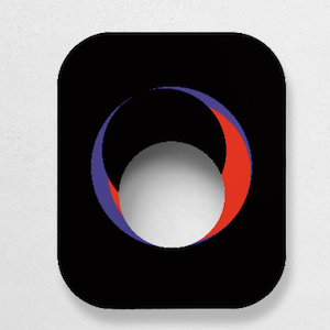
This poster is part of a project called ‘Jazz Types.’ Mytton created a poster about one jazz artist each day, over 100 days, using just type and graphics. 100 posters. This poster was inspired by Canadian pianist Oscar Peterson, known as O.P to his friends. Mytton liked the way a grand piano looked like an abstract ‘P,’ so he used this to spell out O.P. The bars in the background are based on the black keys of a keyboard.

Image Courtesy of Bob Mytton & West of England Design Forum
Bob says, “For me, sketching on paper is still the starting point for all ideas and design, whatever project we are working on. The simple act of making marks on paper and to be able to quickly experiment and try different things making the design process more fun and more creative.”
Kerry Wheeler
Kerry Wheeler is a designer based in Bristol, but originally from the West Midlands. She works as a designer at Home, an agency specialising in Internal Communications.
A little over 12 months, she decided to set herself the challenge of drawing a set of lyrics everyday for 14 consecutive days. As it was around the time of Valentine’s Day, she narrowed the task down even further so that the lyrics had to reference love in someway. Each day, she posted them up on her various social networks. Later, she took some of the more popular sketches and turned them into a series of artworks titled ‘14 Day Heartbeats Challenge’ that she now sells on her website.

Images Courtesy of Kerry Wheeler & West of England Design Forum
Kerry says, “Creating hand drawn images and designs, using basic tools, feels totally all me. The way I draw and sketch is my own style, a visual representation that I wouldn’t be able to create on screen and is totally unique, there is a definite joy in that. It feels totally genuine. Even though the process of creating artwork is longer, and the frustration to getting to the last part and slipping up only to have no Apple + Z is possibly the most frustrating thing in the world, the sense of achievement is incredible when its finished. And if I have an idea in my head, I don’t need to worry about whether I know the right digital tools and tricks to make it look the way I want, there is less holding you back to create exactly what you imagine. There is no ‘undo’ tool so the concentration on getting it right is a lot greater than creating something digitally, and I find my attention span is also a lot more focussed. I can lose hours creating a sketch, whereas on the computer the distractions of modern technology are endless.”


