WATER: Representations in Album Artwork
By Jo Phillips
Water may be a colourless, tasteless and odorless liquid but never underestimate it’s power and limitless personality and forms. On one side of the spectrum it’s healing, cathartic, cleansing and provides hope, faith and survival. Yet on the flip-side it can be a disastrous, deadly, irritating and villainous home-wrecking beast. It can be a means to an end or an end to a means. It’s hardly surprising that musicians find it fascinating. In a series of articles we look at it’s impact on music from lyrics to instruments, to music videos and in this article: album artwork. To avoid unnecessary repetition, here is ten album covers that look at water from a different perspective, with the aid of photography or illustration. If you’re afraid of the colour blue or suffer from cyanophobia, look away now.
NIRVANA- NEVERMIND · 1991 ·Underwater ·Photography

Conceived by Kurt Cobain and art directed by Robert Fisher – who also designed Slayer’s Seasons In The Abyss, Beck’s Odelay and another album cover that featured water, Morphine’s Like Swimming. The cover studies the use of water in birth but also water as an unknown environment. For obvious reasons, the choice of using a naked baby (who we now know is called Spencer Elden) was deemed controversial but is now widely accepted as iconic piece of music history, helped by the fact that this was Nirvana’s magnum opus because it featured Smells Like Team Spirit, Come As You Are, Polly and Lithium. The water concept flows through to the typography of the album’s title that ripples like the substance. The lyrics on the album don’t refer to water and instead focused on the anger he felt after his break-up with Tobi Vail from Riot Grrrl act Bikini Kill as well as other personal experiences and newspaper article stories. The dollar iconography has been suggested to represent the corporate world of rock music, according to Robert Fisher.
Other underwater covers: Foals- Total Life Forever, Pendulum- Immersion, Aaron Shust- Morning Rises
RED HOT CHILLI PEPPERS – CALIFORNICATION · 1999 ·Paradox ·Photography

The skill in this design is how it captures and maintain an audience’s attention by misplacing normality. Graphic Designer Lawrence Azerrad (Jay-Z’s Collision Course, Wilco’s The Whole Love, Foo Fighters’ Skin and Bones), swaps the positioning of the water with the clouds of a sky, as we normally expect to see water on the base of a scenery. However the other elements of the photo make us wonder whether it’s not a photo manipulation at all and is just the photo turned upset down. What if it’s not a swimming pool but a garden roof? Is fiery red supposed to be apocalyptic and the water is the calming opposite. Water isn’t the main theme of the album – despite it also featuring in the CGI music video for the title track – drugs, lust, sexual innuendos and globalization took greater emphasis but an opinion that California isn’t what it seems is reflective of the artwork. Like with the case of Nevermind, Californication was a pinnacle album in the band’s career, thanks to the return of respected guitarist John Frusciante (who also worked with Lawrence Azerrad in designing a solo release) and is one of their signature releases. It features the singles; Around The World, Scar Tissue and the title track Californication, which references Kurt Cobain.
JACK JOHNSON – BRUSHFIRE FAIRYTALES · 2000 ·Rain ·Photography

Unless you’re tucked up in bed or painting on a Sunday morning, rain can be irritating form of water. When it gushes down, plans are delayed, clothes are ruined, vision is obscured and Wimbledon matches are cancelled. The expression of once-popular Hawaiian folk rock artist Jack Johnson says it all. Rain, or as the Hawaiians call it Ua, is just a sod’s law part of life and all you can do is sigh with a lopsided smile. C’lest La Vie. This photograph accompanies Brushfire Fairytales, an album at the start of Jack Johnson’s career. It features a H20-based song entitled Drink The Water but it’s rather negative considering that it narrates about Johnson’s near death experience whilst surfing. It also talks about the fear of drowning and the dangers of surfing. He nearly drowned during his pro-surfer days and didn’t intend on being a musician professionally in the first place. The album cover was designed by Lebanonese film producer J.P Plunier, who has also art directed many sleeves for American singer-songwriter Ben Harper.
Hold on if you can
You’re gonna sink faster
Than you can imagine
Other rain album covers: Gabrielle Aplin- English Rain, Taylor Swift- Come In With The Rain, 2.A.M- Saint ‘O Clock, Carrie Underwood- Something In The Water
KEANE- UNDER THE IRON SEA · 2006 ·Sea Monsters ·Illustration

Richard Andrews (Snow Patrol’s Eyes Open, Athlete’s Tourist, The Magic Numbers’ Take A Chance) designed this woodcut-looking album artwork for Keane’s second album Under The Iron Sea. Despite water possessing a transparent hue, it is often represented with shades of blue and that common perception makes this simplistic image successful in it’s abstrct form. From water grows horses in a style that’s reminiscent of a infamous Guinness advert from 1998, which in turn was inspired by the Walter Crane painting Neptune’s Horses. Therefore this has mythological personality to it (Neptune being the god of freshwater and the sea), compliment by the fact that Keane described their record as: “a sinster fairytale-world-gone-wrong.” Look out for the red eye of the most dominating horse for a touch of evilness. The opening track of the album has the watery name of Atlantic and is accompanied by a black & white music video that includes shots of the Atlantic Ocean and the shore of a beach.
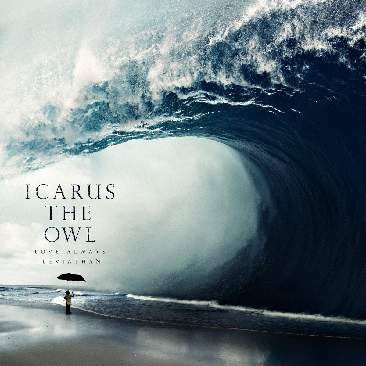
Other water monsters: MGMT- Congratulations, Eisley– Currents, Icarus The Owl
THE TEMPER TRAP- THE TEMPER TRAP · 2012 ·Water Ink Art ·Photography

Milan-born Alberto Seveso (The Black Seeds’ Dust and Dirt, Frankmusik’s Complete Me) uses the unpredictable flow of water to create a one-of-a-kind shape for the album cover to Australian indie rock quintet The Temper Trap’s second album. Although reviews concerning the musical content were mixed, the album sleeve looks beautifully artistic. The creation of ink water art/liquid art is pain staking yet enjoyable process and Alberto Seveso is the master of the craft. If you head over to Twisted Sifter, you can see marvel at his other creations. To ensure that the fast-spreading, shape-shifting ink is captured with detail, as if it was a solid object, Seveso uses a high speed camera. The Italian’s work isn’t restricted to album sleeves, you can peak at it’s glory on tea packaging (Quinteassential), festival leaflets (UKF), wristwatch advertisements (Lansen) and mobile promotions (Votaphone). He started off designing album artwork for metal bands before breaching out into other genres.
Other Water Ink Art covers: The Black Seeds- Dust and Dirt, Orishas- Costita Buena, Delphic- Acolyte, Bleach- Astronomy, Editors- The Weight of Love, US– Crave for Love
SNAKADAKTAL- SLEEP IN THE WATER · 2013 ·Minimalism ·Photography

The calming nature and association of water is represented in this super minimalism artwork, fitting for a band that make chillwave minimalist pop and on a record label entitled Liberation. The fact that the water isn’t disrupted with waves or riffs is also a good point of note made by The Au Review. Snakadaktal are from Melbourne, Australia and have released two albums, with Sleep In The Water being their debut and produced by New Zeleander Dann Hume; also a drummer for the alternative rock band Evermore. With information about the artwork absent at All Music, the credit for the photograph has been lost at sea.
Other minimalism: Incubus- Morning View, Gregory Porter- Water, Letting Up Despite Great Faults- Untogether
OWL CITY- The Midsummer Station · 2012 ·Flood ·Illustration

Even if Minnesota-originated Owl City’s music isn’t particular mesmerizing, the detail and fantastical situation of his second artwork at least brings and holds attention. It’s colour scheme is particularly limited to warn out browns and yellows underneath the water (in the shanty town) and invigorating greens and blues on land, splitting the art into a contrasting two. It’s one of many juxtapositions which also includes the chaos vs.simplicity and clarity vs blurriness. What is most intriguing is it’s possible social commentary on global warming, relevant and well timed to the fears of our generation, as in suspenseful fashion, the sea level is close to flooding the land’s saturated beauty. The freakishly sized fish that stalks a man on a boat as he aims to reach his paradise whiffs of a Jaws pastiche. It was illustrated by Gediminas Pranckevicius, a concept artist from Lithuania, his work also plays with the Laputa-floating-island vision of Guillver’s Travels. You can see more of his work at: www.gedomenas.com
JONI MITCHELL- Court and Spark · 1974 ·Subtle/Outline ·Illustration

Court and Spark is one of the most celebrated albums of Joni Mitchell career, exemplified by it’s inclusion in the book 1001 Albums You Must Hear Before You Die and is one of her jazz-inclined releases. For those music fans that aren’t completed obsessed with the Canadian folk artist, Free Man In Paris is perhaps the most recognizable song because it was used as the theme tune to American television show The Saturday Evening News and has been covered by Elton John, Alanis Morissette, Neil Diamond and Surfjan Stevens. The artwork shows an ocean wave and a landscape drawn in it’s most simplest form and somewhat like an album cover from José González (including being drawn on paper that’s cream or off-white). It was art directed by Anthony Hudson, also responsible for Joni Mitchell’s For The Roses, albeit that’s a photographic cover.
BLUR- The Great Escape · 1995 ·Diving/Speedboat/Escapism ·Photography

The perspective of the photograph gives it’s edge. It appears to be from the point of view of the water. Tight themes on the album were loneliness and detachment and the album’s title reflects the need to leave this cycle. The woman in the photograph feels liberated by jumping into the water, giving the ocean a positive context of freedom. Although it features some classic and adventorous Blur tracks that escaped from their original narrow conotations of Britpop, such as The Universal and Stereotypes, Damon Albarn wasn’t proud of it and called it a “messy” affair. The photograph’s colour looks outdated and typically 1990’s and was captured by Tom King; who was also involved in the artwork for Blur’s commemorating collection 21 from 2012.
Eliza Shaddad- Waters · 2014 ·Colour Alone ·Painting

She may not be the most famous artist in the list or have the most complicated album cover but the fact that we recognize that this water just from a combination of blues, turquoises and whites is a phenomenal study on human perception. Released only last year, Eliza Shaddad’s EP Waters has a pop rock production style (bass drum pounding, melodic/jangly flowing guitars and a breezy voice) that feels like it’s sailing an ocean and occasionally trapped in it’s refreshing waves. Eliza Shaddad is a mixed-race musicians with Sudanese and Scottish parents and is based in London. Coincidentally, her great great grandfather was part of a 19th century painting group called The Glasgow Boys and it wouldn’t be surprising if his talented blood run through Eliza Shaddad and consequently convinced her to paint the artwork . Her highest achievement was providing the hauntingly ethereal vocals on the blissfully orchestral Clean Bandit’s Birch – an unreleased track and a break from their dance leanings on New Eyes. When you consider that the classical-crossover band helped bring success to Jess Glyne, it could be clean sailing for her music career.
Other honourable mentions:

Surreal/Abstract

Comical

B-Movie Horror


