The Scent of Graphic Design
By Jo Phillips
In 1961 Christiane Montadre, Desmond Knox-Leet, and Yves Coueslant, three former art students started what was to become, over 60 years later, one of the most iconic scent brands in the world. Find out more about this incredible birthday of this iconic brand in The Scent of Graphic Design.
Interior designer Christine Gautrot, artist and painter Desmond Knox-Lee, and theater director Yves Coueslant initially wanted to have a shop for fabrics and wallpaper designs. As all three had a love of graphics they launched their brand, which came together in the now-infamous shop in Paris the Diptyque boutique at 34 Boulevard Saint Germain, with a unique and now instantly recognisable design visual and an anesthetic was born, along with great fragrance offering.
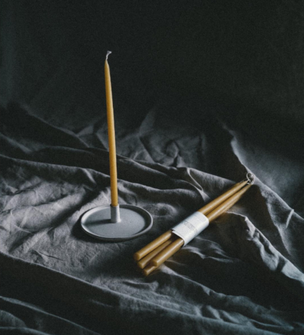
Alongside a very clear visual, deeply rooted in black and white and specific fonts, travelling was part and parcel of their world. They journeyed home with many extraordinary things from the travels and from this, their Paris flagship store became probably one of the first-ever concept stores. It was these journies that inspired the first fragrances diptyque became famous such as Do Son or the fragranced much loved (and much weakly copied) candle Figuier.

But ultimately no house becomes an institution without an instantly recognised visual language and this is part and parcel of diptyque’s success. As recognisable today as it was when it started the black and white graphics are being re-introduced for this 60th Birthday.
Initial inspiration from textiles, they created their geometric, minimal, picturesque aesthetic, innovation at the time, yet still now having a modern edge, this bold graphic flair and ability to produce countless optical effects. Right from the start, the diptyque codes were laid down: the oval shape of the labels, the repetition of lines and motifs, the interplay of shapes and colours.
On this remarkable birthday diptyque continues to pursue drawing on sources from its own aesthetic history, revisiting it, and bringing new surprises to the table.
Each oval label on each product, along with the lines and the standout font all became the symbol of the brand. So for this year, this is a revisitation of the designs for four classic candles from the range, with each piece of packaging and each candle exploring a different facet of the lines of black and white, the oval and the fonts are celebrated with added soft colours per scent.
Find the iconic Rose with a soft powdery grey-pink label candle, the Tuberose with its softy grey -baby blue, figuier is, of course, a soft, soft green echoing the softest juicy fig and Baies with a gentle burnt orange-red. Each candle is boxed with a unique pattern by fragrance and each glass container echoes that chosen pattern.
This house with its modern yet timeless style, its playful genius for combining different time periods and worlds is as desirable now as it was 60 years ago. As this is the brand’s 60th birthday it’s fair to say there will be other wonderful birthday surprises to come, which at .Cent we will of course keep you posted of.
To find more information go to the diptyque site Here.
If you enjoyed The Scent of Graphic Design, find out about one of their stores Here